Ecstatic Meditations: Norman Bluhm’s Painting Over Five Decades
by Raphael Rubinstein
Looking at the ways in which Norman Bluhm’s painting has developed since the early 1950s, it’s impossible not to be struck at how thoroughly his work has changed and in what unexpected ways. But as soon as one has acknowledged the scope of Bluhm’s artistic evolution, one must also recognize the strong continuities in his work, the motifs and methods that have survived, albeit in mutated form, through successive stylistic changes as the artist moved from an Abstract-Expressionist-derived practice in the 1950s and early 1960s to the sensual architectonics of his recent work.
I note Bluhm’s steady transformation at the outset of this essay because long-term artistic development is not something to be taken for granted, at least in our era. For every example like Bluhm’s of an artist who has grown and continued to surprise over a lifetime, there are dozens, or even hundreds, of creators who after concocting an apparently novel style seem content to repeat it in minor variations for the balance of their careers. At the other extreme are those artists who seek to change their artistic identities abruptly and completely, who develop through rejection of their previous work. This later is not Bluhm’s way and, given his profound sense of painting as a craft and a calling, I doubt whether it has even tempted him. A resourceful and awesomely capable painter, when faced with an artistic obstacle Bluhm has always been able to work his way through it, rather than turn aside in another direction.
It’s also worth noting, here, that the shifts in Bluhm’s painting, always gradual and organic, have never been in response to changing art-world fashions. And yet, for all his independence from trends and his intense engagement with certain earlier moments in the history of Western art, Bluhm clearly lives and works in the present. Indeed, his development offers some interesting parallels with the problems faced in recent decades by many other painters, both of his generation and younger. Beyond the personal scope of his artistic achievement, his career offers an exemplary case of how one painter has been able to move beyond the often stultifying esthetic dialectics that eternally pit mid-century modernism against its multifarious enemies.
Painting in Paris in the first half of the 1950s (he moved to the French capital in 1947), Bluhm found his way from Cézanne-influenced landscape painting, often done in plein air, to allover abstraction. By 1953, his work offered the viewer deep-hued curtains of color built from countless short brushstrokes. The spatial movement of these paintings tends to be downward; they can evoke rain falling in a tropical forest, dropping theater curtains and the descent of some mythic night. Painted light to dark, that is, the bottom-most layers of color are the most brightly hued, the mid 1950s paintings quietly radiate with a kind of filtered light that seeps through the interstices of the marks. Like other abstract painters in the 1950s, Bluhm had studied Monet’s late work, but he had also paid attention to medieval stained-glass windows (far more accessible to an artist working in Paris than to one in New York) and was an enthusiast of Corot.
After his relocation to New York in 1956, Bluhm continued, for a little while, to make these dense compositions, as one can see in paintings such as Jaded Silence (1957). But in the second half of the 1950s, the hitherto tightly bound webs of Bluhm’s work began to open up. The marks became looser and longer, and the spaces between them widened; the cumulative effect as one studies the paintings in succession is of a piece of wool being gradually pulled apart. By 1959, the year in which Bluhm emerged as a stylistically individual painter, the abbreviated strokes had turned into out-and-out gestures. Allover structure gave way to what has been termed “centrifugal” compositions. In a trio of large, forceful paintings from that year -- The Anvil, Chicago 1920 and Winter Nights -- Bluhm declares his allegiance to gestural abstraction. These are violently achieved paintings strewn with jagged marks that appear to have shattered on impact. Profuse drips and an array of warring, meaty gestures establish a sense of turbulent movement and intense struggle at the same time the play of values creates a patchwork pattern of darks and lights. 1
In the latter two paintings, both of which are triptychs, the horizontal format that Bluhm was already favoring -- hardly surprising, perhaps, in a landscape-conscious painter -- became a little more pronounced (Chicago 1920 measures 7 by 9 feet, Winter Nights 8 by 12 feet). This expanding scale was, no doubt, partly a result of Bluhm’s living in New York where the influence of Jackson Pollock and large-scale American painting was stronger than in Paris. But even as he was absorbing New-York influences, Bluhm was already starting to separate his work from that of the Abstract Expressionists. Although not immediately evident, the advent of multi-panel canvases in Bluhm’s work marks a break with the pictorial practice of the preceding generation. Influenced by mural painting and Picasso’s Guernica in their conception of large-scale canvases, and no doubt disinclined to turn back to devotional Italian painting of the Renaissance, Pollock, de Kooning, Kline and nearly every other “first generation” Abstract Expressionist almost never used more than one stretched canvas per work.
By contrast, in the later 1950s, Bluhm and other younger American artists such as Ellsworth Kelly, Alfred Leslie and Robert Rauschenberg embraced the possibilities of multiple panels. While Bluhm recalls that his triptychs were partly the result of necessity -- it was the only way he could paint that large and still manage to get the canvases out of his studio -- this dividing of the painting support, a format which would later be taken up by countless other painters, helped drive a thin wedge (almost literally) in the prevailing assumptions about how to make a painting, and also, perhaps, into modernist assumptions of wholeness. Not that Bluhm was consciously attempting to introduce art-historical allusions into his 1959 paintings -- the triptych format’s long pedigree wouldn’t become important to Bluhm until his grand polyptychs of the 1980s and 1990s.
Another element that distinguishes Bluhm from the Abstract Expressionists, even in his “gestural” period (circa 1959-1967), was noted by Thomas Hess. One of the best writers on Bluhm’s painting of the time, Hess observed, from the vantage point of 1973, how the artist’s method involved “accretions, constructions of large shapes from small units, and then larger patterns from these shapes.”2 This procedure, Hess felt, was so unlike Pollock’s and de Kooning’s wide sweeps as to be “the opposite of most Abstract Expressionist practice.” Indeed, for all his painterly energy and nuanced use of gesture (Hess detected three “basic units” in the gestural paintings), Bluhm has actually spent the greater part of his career working at a significant remove from the kind of painting generally associated with Abstract Expressionism. While many of his generation remained unfailingly committed to the ethos and style of gestural abstraction, Bluhm’s most intense involvement with that brand of painting really only lasted 10 years.3
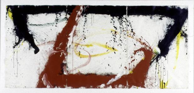
The opening-up process that had begun after Bluhm’s arrival in New York continued, and by 1961 his art had again transformed itself. Drastically reducing the number of forms per canvas, the artist was able to make the individual shapes larger while also leaving more open space between them. In paintings such as Black Card (1961) and Iron Horse (1964), dark shapes reminiscent of tree trunks or post-and-lintel constructions hug the edges of the painting, almost as if they were shoring up the canvas against some enormous external pressure. In other works such as Caliburn (1963) and Sangamore (1963), these structural forms shoot across the center of the picture, deflecting when they reach its boundaries like a caroming billiard ball. With their dramatic darks and lights and their simplified, beamlike compositions, these paintings are clearly indebted to Franz Kline, an older painter Bluhm admired greatly and learned from, but, as Hess’s remarks remind us, Bluhm was not simply repeating a received style.
Indicating how undoctrinaire Bluhm could be even in relation to his own work, one of his most ambitious paintings of the early 1960s, Oz (1961), doesn’t have any blocky structural supports. Instead, the massive (8 by 24 feet!) four-panel work is dominated by a dark, upside down horseshoe shape, slightly off-center and angled to the right. The form seems to be moving like a galleon or mythic sea monster across the expanse of the canvas, attended by spouts of water, fireworks and hurled garlands -- very different in feeling from the girderlike thrusts of Kline’s paintings. Writing about Bluhm’s work in 1962, a year after Oz, poet and critic Frank O’Hara declared:
“Bluhm is the only artist working in the idiom of abstract-expressionism who has a spirit similar to that of Pollock, which is to say that he is out -- beyond beauty, beyond composition, beyond the old-fashioned kind of pictorial ambition.”4
With a hindsight that, sadly, was not granted to O’Hara, who died in 1966, we know that Bluhm in fact found his way, over the next decades, to nothing less than beauty, composition and “the old-fashioned kind of pictorial ambition.” Indeed, the swelling curves of the central shape in Oz already anticipate the sensual elements that enter Bluhm’s paintings toward the end of the 1960s and soon come to dominate them. In a 1987 interview, Bluhm himself discounted the Pollock influence, which had also been theorized by critic Lawrence Alloway in the early 1970s5: “Later people said that the work I did in the late ‘50s and early ‘60s came out of Pollock. . . . My manner of working was much more like Bill’s [de Kooning’s].”6 Bluhm’s work does, indeed, share much with de Kooning’s, but the artist’s demurral does not negate O’Hara’s observation. By locating Bluhm in a jazz-like “out thereness,” O’Hara must have already sensed that his friend was on a path that would lead him away from conventions of midcentury abstraction.
Throughout the paintings of the early 1960s one can see what Hess meant when he wrote of Bluhm’s “accretion.” Appearing, from a distance, as massive gestures, the bulky shapes that frame and span the compositions reveal themselves, on closer inspection, as the result of countless brush loads of paint snapped onto the canvas. The dense flurries of splattered paint spreading from the edges of the shapes are testimony to the force of Bluhm’s gestures.
Sharing the “empty” areas with these drips and splatters are skittering brushmarks which describe truncated loops and arcs against the white grounds. Painted with a range of colors -- black, yellow, ocher, purple, crimson, etc. -- these drawn lines are clearly the first marks made on the canvas. We can thus read them as traces of the artist’s initial exploration of the blank canvas, a means of feeling his way into the painting, a sketch of the painting’s possibilities. Signposts for the painting to come, these high velocity lines also hint at alternative directions, compositional roads not taken, reminding us of the essential freedom of both artist and viewer in the best gestural abstraction.
The kind of rapid, nervous drawing that zips around Bluhm’s paintings also turns up in the work of some of his contemporaries, in particular Joan Mitchell. One can surmise that these zig-zagging gestures must have been partly the result of painters such as Bluhm and Mitchell searching for an amalgam of Pollock’s fluid dripped lines and de Kooning’s angular slashing strokes. Reviewing a 1991 show of Bluhm’s early 1960s’ work, New York critic Barry Schwabsky saw in these anticipatory lines, evidence of not merely Bluhm’s painterly freedom but also of his historical liberty. They represent, for Schwabsky, “a half-insistent, half-diffident way of flirting with the depiction of space rather than either declaring it or abandoning it, a glance past the absoluteness of any position (whether in the physical or ideological sense).”7